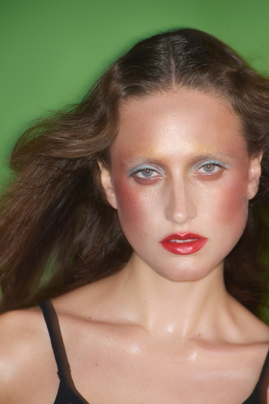
There is something cinematic about BYREDO’s Vesuvio. Not simply in its colour story, but in the way it holds tension, between calm and chaos, softness and eruption, memory and myth. Inspired by 18th-century Neapolitan paintings and the shifting moods of Mount Vesuvius, the limited-edition 18-colour palette is a study in duality. Pastel lilacs and watery greens sit alongside magma orange, volcanic pink and molten bronze; serenity meets spectacle in a single mirrored case.
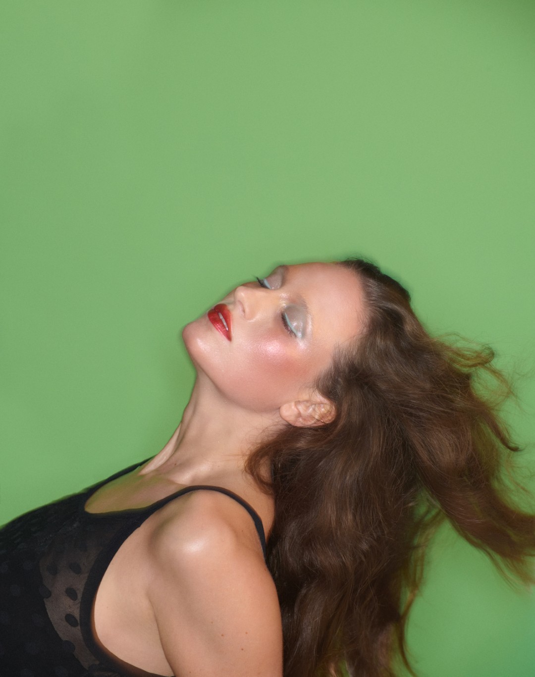
At the centre of it all is Lucia Pica, BYREDO’s Creative Image and Makeup Partner, whose Neapolitan roots inform both the emotional and chromatic landscape of the collection. Captured by Johnny Dufort in a campaign that explores movement and stillness as inseparable states, Vesuvio feels less like a product and more like a place, one where colour becomes narrative, and contrast becomes instinct.
Here, we speak to Pica about memory, modern beauty, and why the sublime often lives in the quietest moments.
The Vesuvio Palette is inspired by 18th-century Neapolitan paintings. How did these artworks guide your choices in colour, texture, and overall mood for the palette?
The inspiration process began with an exhibition I saw in Rome, near Naples, called Napoli Ottocento, which showcased 19th-century paintings. At that time, Naples was a grand and significant city in Europe, comparable to London, Paris, and Rome. It seemed as though everyone was travelling there to see the volcano and witness the light explosions that were happening, and these were beautifully captured in the artworks.
To see Naples depicted in such a mesmerizing way, in this moment of history, really stayed with me. There was such contrast, intensity and stillness side by side.
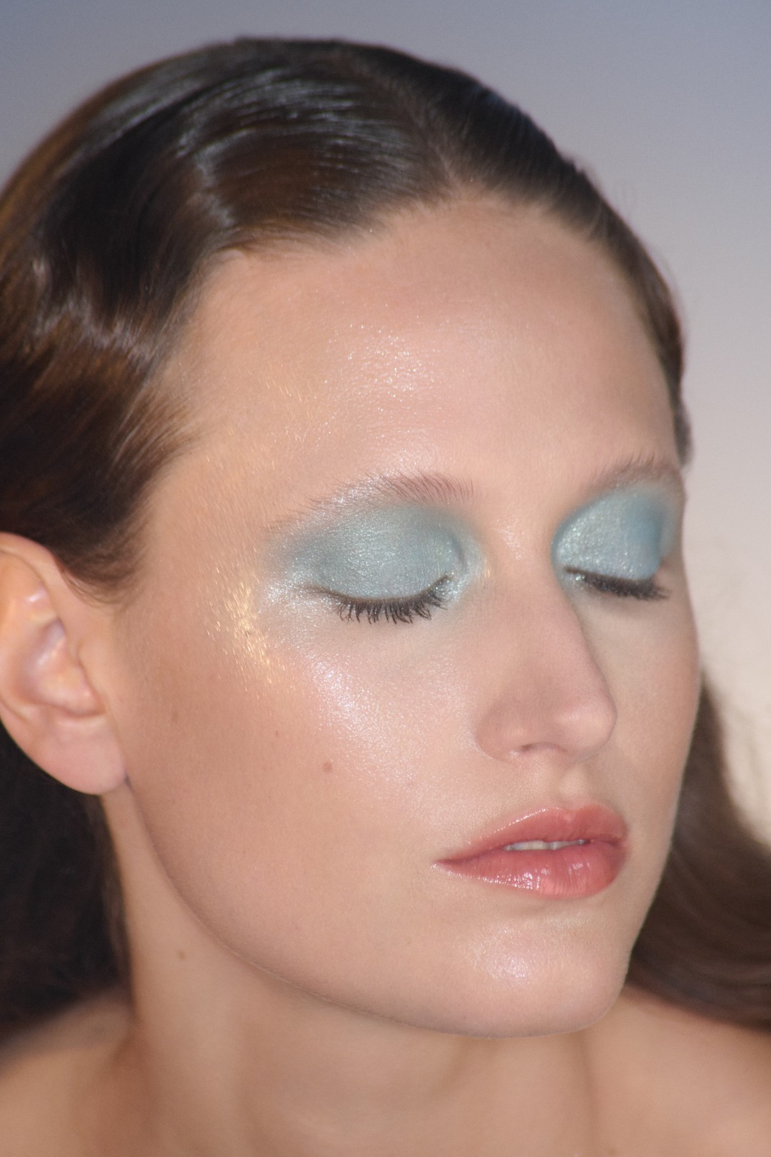
The paintings were also uplifting. The colours used were dreamy and light, warm yellows, mauves, pinks, blues, mixed with deeper tones like ash and earth. It’s that contrast between all of this happening on a calm backdrop of the pastel coloured landscape that was interesting to me. The result is a very bright, lively palette. It feels fresh, exciting, almost bubbly, full of emotional colour that moves between softness and intensity.
You often describe makeup as a form of storytelling. What narrative or journey do you hope users experience when they explore the Vesuvio Palette?
I imagine Vesuvio as a journey across inner landscapes, an emotional topography. It might begin in stillness, with a soft haze of muted pink or grey, and then move into intensity, a glint of gold, a flicker of red. The story doesn’t have a fixed beginning or end. It’s more like a diary without a line, intimate and open to interpretation. At the same time, it’s a really fun, positive, and uplifting selection of colours. There’s an energy in the palette that feels joyful, like little sparks of emotion you can wear and play with.
It invites freedom, and that’s part of the narrative, too.
The palette blends warm and cold pastels with bright accents. How did you decide on this balance, and what emotions or sensations were you aiming to evoke?
Vesuvio started with contrast. I wanted to capture the complexity of the Neapolitan atmosphere, a place that’s warm and raw, luminous yet veiled. Cool pastels bring a sense of calm and openness, while sudden bursts of bright colour feel like a gasp of air. That emotional tension shaped everything.
The textures are rich, pigmented, and easy to blend, whether with fingers or a brush. There’s a balance of finishes: matte for depth, satin for softness, and subtle shimmer to bring light. I think of it almost like chiaroscuro, using texture to shape light and shadow.
For me, it’s important to offer a sense of direction, but also freedom. There are no rules. The palette is structured to invite exploration, to let each person create their own rhythm and story.
Could you walk us through your process from initial inspiration to final product? Were there unexpected discoveries or challenges along the way?
The process began with a feeling, a pull back to the Neapolitan paintings and the way they quietly hold both softness and intensity. I was drawn again to their pastel light, interrupted by vivid, almost volcanic flashes of colour. That tension felt like an echo of Naples and Vesuvius, and I wanted to translate that emotion into 18 shades.
When I create a palette, the starting point can be many things, an environment, a book, a painting, even just a sentence. From there, a story begins to form. I gather materials, fabrics, references, pigments, and start mixing shades myself, by hand. It’s a tactile process. I place the colours next to each other and move them around until I feel a sense of balance.
Some colours shift unexpectedly, they deepen or ask for more restraint. Others surprise me completely. Staying open to the unexpected is part of it. I don’t over-control the process, because sometimes an accident leads to the most resonant result.
Once the colours feel right, they’re sent to the labs, where they’re translated into textures. That part is crucial. Whether it’s a matte, a satin, or a high-shine, the texture affects how the colour lives on the skin.
The palette draws from historical landscapes yet feels contemporary. How do you translate classical art references into modern, wearable makeup?
There’s always a mix of emotional instinct and visual response. Some colours come directly from the paintings, but it’s how I position them within the palette that brings the feeling to life.
At the same time, I’m constantly thinking about how the colours will live on someone’s face. That’s essential. It has to be wearable, harmonious with the skin, never too primary or artificial. You can make almost any colour wearable if you get the undertones right, that’s where the refinement is. I create colours as an expression, but they also have to connect. The colour needs to belong to the person wearing it.
With Byredo’s focus on expression and individuality, how does Vesuvio reflect your broader vision for the brand and your work as Creative Image & Makeup Partner?
It is part of the same language I have defined with Byredo. Expression of individuality mixed with thought through use of colour, expression of emotions and personal storytelling. It’s is an extension of who I am really.
For more stories of beauty from around the world, visit our dedicated archives and follow us on Instagram.